
Delivery Analytics is where you go to answer "why did my delivery rate drop?" without bouncing between five different views. It gives you one connected page that starts at your root domain and lets you drill all the way down to the exact combination of mailstream and receiving domain that's causing the problem.
To get started with delivery analytics, you need to connect one or more ESPs/MBPs to the platform so you can receive the analytics data in the dashboard.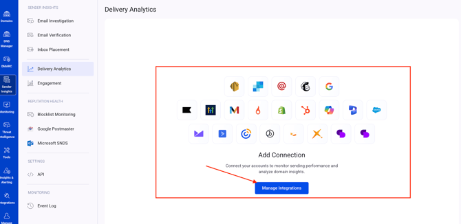
You can find the integration guides for supported ESPs/MBPs in the EasyDMARC knowledge base ESP integrations section.
Once an ESP/MBP is connected and the data is collected, you will be able to see all the analytics in the dashboard. The details of the delivery analytics dashboard and how it works are described below:
The page is made up of five parts:
- Engagement Overview
- Top Problems & Volume by
- Outbound sender flow
- Delivery Breakdown
- Inspect drawer
Header
At the top of the page, you have:
- The Domain dropdown, to pick which verified domain you're analyzing
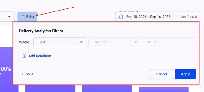
- Filter, which opens a condition builder so you can narrow the whole page down by Subdomain, Sending Source, From Email, Mailstream, or Receiving Domain
- Select Date Range, with presets or a custom range
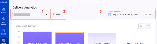
Clicking Filter opens the condition builder — you choose a Field, a Condition (is / is not), then one or more Values, and can stack multiple conditions before applying.
Engagement Overview
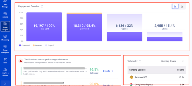
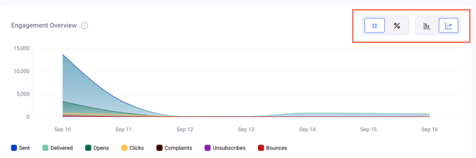
This is your funnel at a glance for the selected domain and date range — Total Sent, Delivered, Opens, and Clicks, broken down into Converted, Bounced, and Drop-off.
- A bar/trend toggle switches between totals for the period and a day-by-day area chart
- A count/percentage toggle switches the values between raw numbers and percentages
Top Problems & Volume by
Two panels sit side by side just below the overview:
- Top Problems – worst performing mailstreams: these are the mailstreams losing the most emails in the selected period, each with a Details link into the Inspect drawer
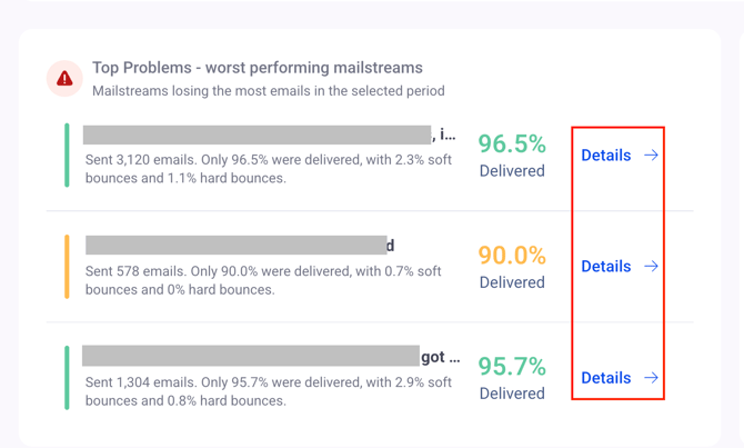
By navigating to the details of a mailstream, you will see two sections - overview and event logs.
The overview section shows:
1. The total number of emails sent during the selected period.
2. The percentage of sent emails successfully delivered to recipients.
3. Percentage of emails permanently rejected due to invalid addresses or other permanent delivery failures.
4. Percentage of emails temporarily rejected due to issues such as a full inbox, server errors, or temporary delivery limits.
5. The name of the selected mailstream which is the subject of your emails in the campaign
6. The recipient domains' list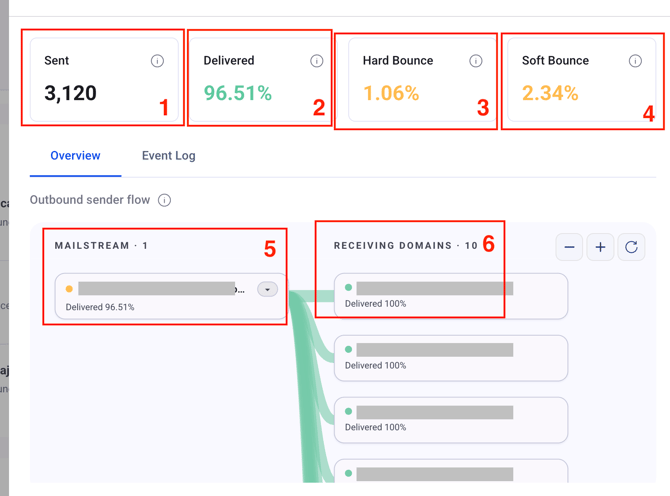
The event logs in the details shows all events(bounce, click, open, etc.) per the selected mailstream with the options to filter the data per multiple conditions as well as exporting the data as CSV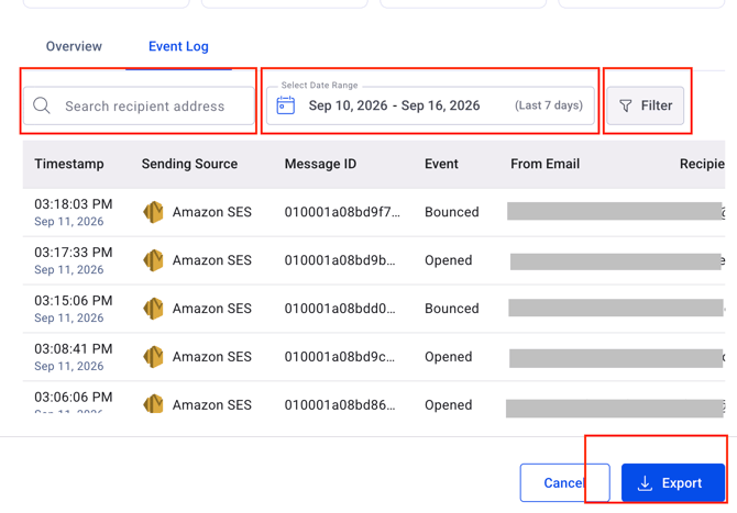
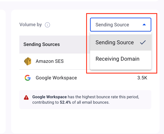
- Volume by: a table you can switch between Sending Source and Receiving Domain, plus a callout flagging whichever source is contributing the most to your bounces
Outbound sender flow
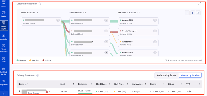
A color-coded map (Healthy/Warning/Critical) showing how mail flows from your root domain, through your subdomains, out to each sending source.
- Click any node to isolate its downstream path — everything else collapses into a small "▸ N" badge you can expand back
- Use + / − to zoom, the refresh icon to reset, and the expand icon to open it full-screen
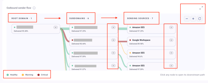
The outbound sender flow is designed to show the data with the following hierarchy:
1. Root domain
2. Subdomain
3. Sending sources which are visible when extending the view of any subdomain in the chart
4. From addresses used by any sending source which you extend to view the details
5. Mailstreams - subject of campaigns/bulk emails send from the extended from address
6. Receiving domains of the extended mailstream
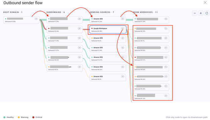
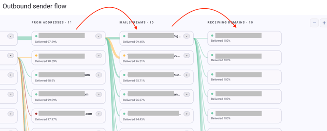
Hovering over each section in the outbound sender flow, you will be given the options to see the details of the given attribute.
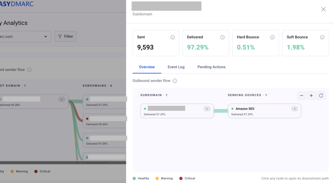
You can click "View details" to see the details of the attribute in a separate sidepanel: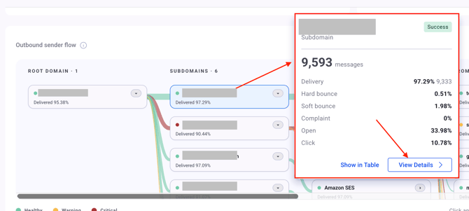
Or you can use the "show in table" option to see the details in the delivery breakdown table below:
Delivery Breakdown
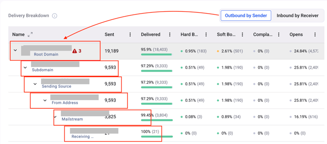
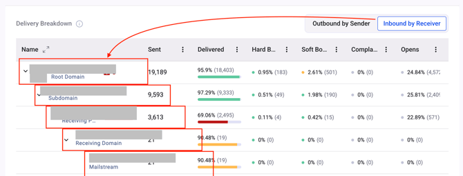
This is the core of the page — a nested table where every row, at every depth, shows the same columns: Sent, Delivered, Hard Bounce %, Soft Bounce %, Complaint %, Opens %, Clicks %, and TTD (average time-to-delivery for that row).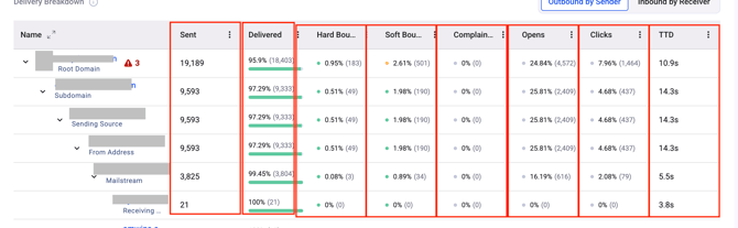
A toggle above the table switches between two ways of drilling down, both ending at the same place (a specific mailstream × receiver combination):
- Outbound by Sender: Root Domain → Subdomain → Sending Source → From Address → Mailstream → Receiver
- Inbound by Receiver: Root Domain → Subdomain → Receiving Provider → Receiving Domain → Mailstream
Each column in delivery breakdown table has the "three dot" sign next to it providing options to pin, autosize, choose, or reset columns: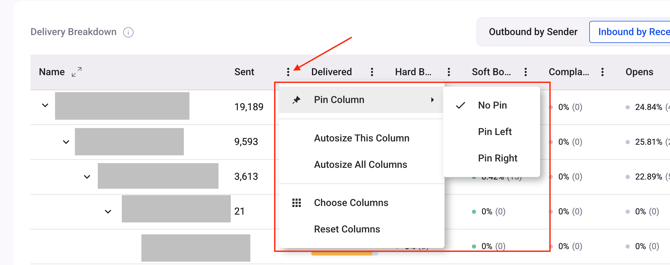
Some rows carry a Root Cause badge. This flags the row that's actually responsible for a meaningful share of its parent's lost mail — not just whichever row looks worst. Follow the badges down the tree; the deepest one is usually your real root cause.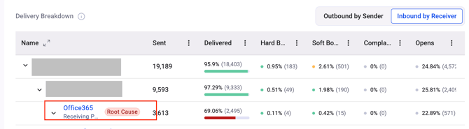
Inspect drawer
Clicking any entity's name — in the table, the sender flow map, or a "Details" link — opens a drawer on the right without losing your place in the table.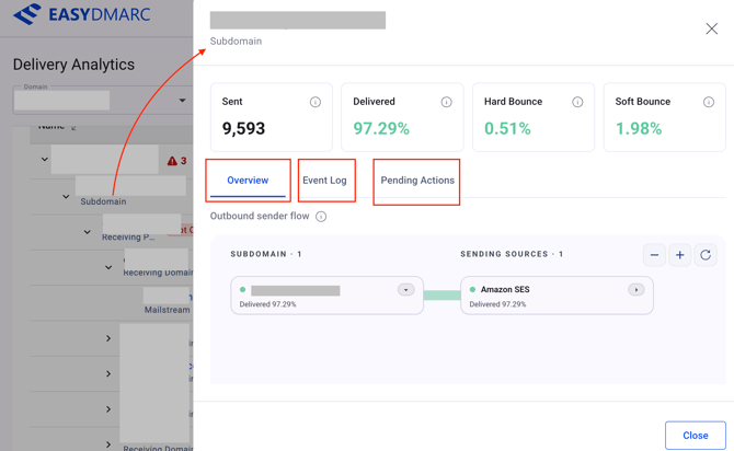
The drawer header shows Sent, Delivered, Hard Bounce, and Soft Bounce for that entity, with up to three tabs below:
1. Overview — a scoped version of the sender flow map for just this entity.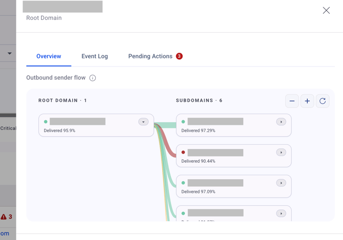
2. Event Log — the underlying message events, with a recipient search box, its own date range and filter, and an Export button. Columns include Timestamp, Sending Source, Message ID, Event, From Email, Recipient Email, and the raw delivery status message.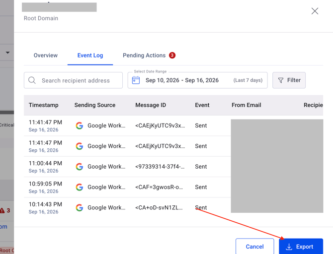
3. Pending Actions — open remediation actions grouped by domain and sending source, with a count badge. Each action expands into the affected recipients, and can be exported or marked as done.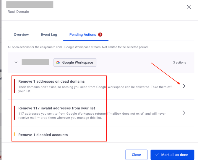
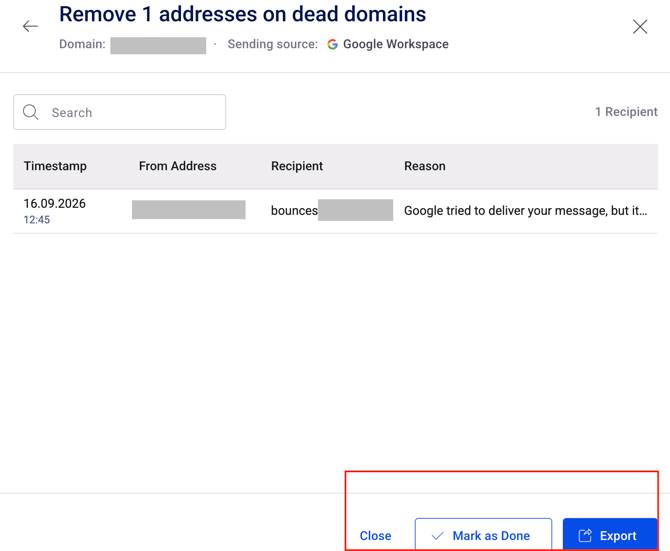
Note: Not every entity has open actions — when there are none, the tab shows an empty state instead.
If you have any questions not addressed in this guide, feel free to reach out to EasyDMARC experts.